A new brand identity
for Hawaii's leading airline
Showing his characteristic marketing chutzpa, Maurie Myers contracted a mainland firm that specialized in airline graphics to design a totally new look for his incoming fleet of 737s. It was our assignment to develop a new brand identity system for Aloha Airgroup based on the jet, and
to extend the branding system to Island Air, its prop plane subsidiary.
Developing a logical system
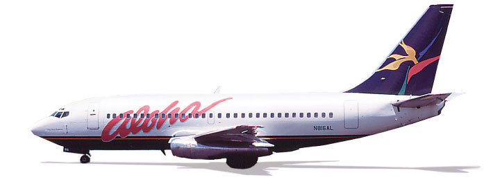
A typical identification system begins with a logo, typographic signature and color system. These are then adapted to a range of collateral items from letterhead to signage. In this case Aloha's system was to evolve from the most visible piece, the jet.
We organized the airplane graphics into three categories: typographic, pictorial and color based. After considerable exploration, we reviewed the options with the client and decided to use the Aloha script as a logotype, the flower as a promotional graphic motif, and the three main colors as the brand color system.
|
 |

The most natural solution would have been to use the bird of paradise flower as a logo and the Aloha script as a logotype.
However, the flower was too spindly and intricate to work across a variety of media. This led us to propose a solution where the flower would be used as a promotional graphic and the script as a logo.
By using the three elements in different combinations we could adapt to most situations while building a lively, consistent identity.
|

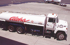
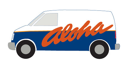 The ground support vehicles were designed to mimic the livery, and the flexible graphic system was consistently applied to everything from baggage carts
to fuel trucks.
The ground support vehicles were designed to mimic the livery, and the flexible graphic system was consistently applied to everything from baggage carts
to fuel trucks.
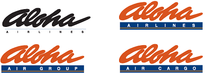 At the top left, the Aloha logotype is shown in a signature format devised for most airline marketing uses. The logotype is adapted for various divisions of the parent company.
 The design for the Aloha signage system. The solid blue background sends an organized and elegant tropical signal, appropriate to Aloha's leadership position.
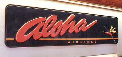 The Primary Sign Aloha felt it was important to welcome its customers with a sign that demonstrates its leadership position and reflects confidence in providing passengers with premium service. This sixteen foot long sign at Honolulu International Airport is designed with raised letters and a sculpted flower.
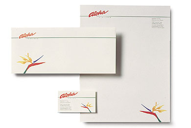 The letterhead system was designed to help build awareness of the new brand identity.
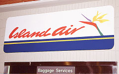
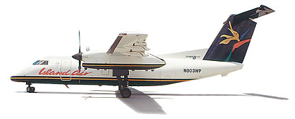 We used Aloha's livery design and produced an Island Air logotype to mimic Aloha's stylized letterforms.
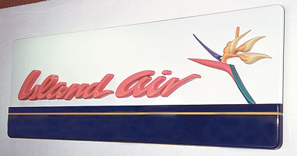 Aside from the name, the only noticeable difference in Islands Air's identity system is
a white background for signage and promotional materials contrasting with Aloha's dark blue. This lets Island Air share the strength of Aloha's more prominent identity but also provides a bit of distinction.
Aside from the name, the only noticeable difference in Islands Air's identity system is
a white background for signage and promotional materials contrasting with Aloha's dark blue. This lets Island Air share the strength of Aloha's more prominent identity but also provides a bit of distinction.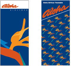 The tail flower from the jet in use as a promotional graphic on a ticket jacket and timetable. The variations on this theme are endless.
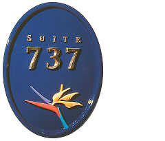 The executive club was renamed Suite 737 after the new jets. This sign combines a sculpted flower in five colors and polished brass typography to evoke an elegant executive sensibility.
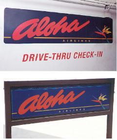 From parking lot to jetway, a consistent signage program helps build the brand.
 A more economical approach used in less prominent areas of the airport.
 The Aloha identity system was rolled out over a three to four year period as part of the natural cycle of refurbishment and replacement.
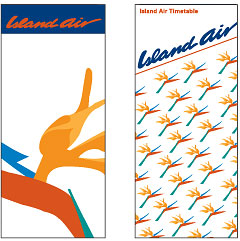 The tail flower on the ticket jacket and timetable with a white background.